Work
Growing Brands, Building Trust
For CapCircle and Embera Partners, I developed trust-centered brand identities that merge financial stability with forward-thinking design


Project Overview
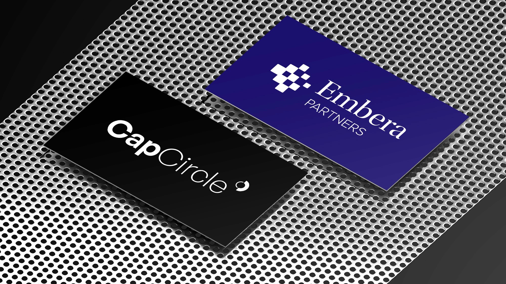
CapCircle, a German investment boutique, and Embera Partners, an Austrian financial advisory firm, needed strong brand identities in the competitive fintech sector. The project involved creating visual identities, conveying trust, innovation, and financial expertise.
Objectives: Create modern, memorable logos and cohesive brand identities, while developing comprehensive guidelines for consistent application across various media.
Challenges: Balance professionalism with innovation, differentiate each company in the fintech market, and ensure the designs resonate with their specific target audiences.
My Roles
• Developed new logo concepts and brand identities • Produced brand guidelines to ensure consistent application across various media • Designed brand applications and mockups to showcase the identities in real-world contexts
Tools
Figma
Illustrator
Photoshop
Timeline
Sep-Dec 2023
Take a Look
In 2023, I took on the challenge of creating brand identities for two forward-thinking fintech companies: CapCircle in Germany and Embera Partners in Austria. This project, along with my work for DebtRay (see DebtRay case study), deepened my interest in fintech. The fast-evolving financial technology sector combines traditional finance with modern innovation, offering a unique space for brand creation.
Fintech brands must inspire trust, convey accuracy, and balance stability with a modern edge. A successful brand communicates reliability—key in financial services—while also highlighting innovation. It's about balancing tradition with forward-thinking design.
For these identities, I focused on each company's values, audience, and market position. The goal was to simplify complex financial concepts into clear, memorable visuals that resonate with both tech-savvy investors and traditional institutions.
CapCircle
Based in Frankfurt, CapCircle is an investment boutique focusing on early-stage financial technology startups. Their approach involves leveraging partner knowledge and extensive networks in the financial sector.
Logo Design Process
The logo design for CapCircle aimed to create a simple, tech-savvy, and modern visual identity that would resonate with founders of fintech startups and tech industry investors.
I developed the logo using General Sans, a contemporary and versatile typeface. The design features a distinctive symbol of two arcs forming an open circle, representing the two "C"s in the company name and conveying ideas of connectivity and growth.
Two C's forming one circle: this symbol can be used as a standalone element, offering flexibility in various branding applications.
Color Palette
While the logo itself uses a stark black and white palette for a bold, contemporary look, CapCircle's broader color scheme combines grays, browns, and olive tones, creating a sophisticated and conservative aesthetic. This palette:
Conveys a sober, institutional quality fitting for financial investment
Enhances clarity and usability in digital and print materials
Uses grays as primary colors, brown tones for accents, and olive as a supplementary hue
This thoughtful color selection reinforces CapCircle's image as a trustworthy, professional player in the fintech investment space, while allowing for subtle visual distinctions in their branding.
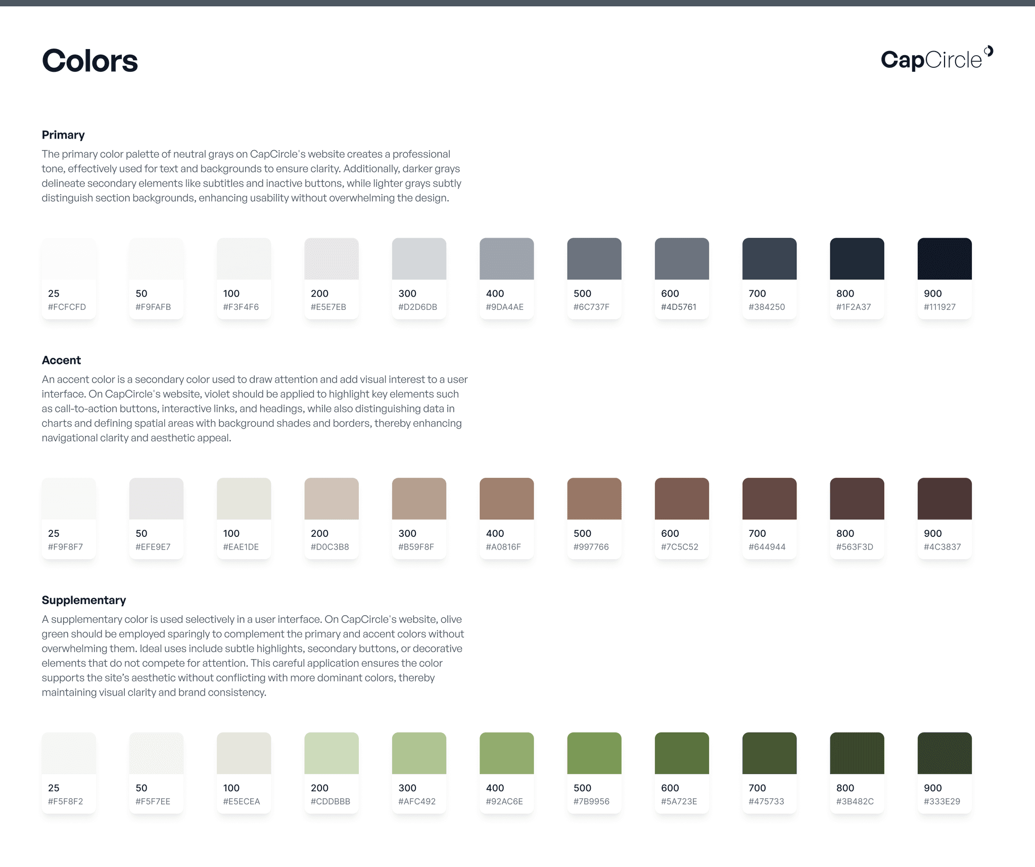


Reproduction of CapCircle's color palette guidelines: This combination of gray, brown and olive tones creates a conservative yet sophisticated aesthetic, reinforcing the brand's position in fintech investment.
Colors in Practice
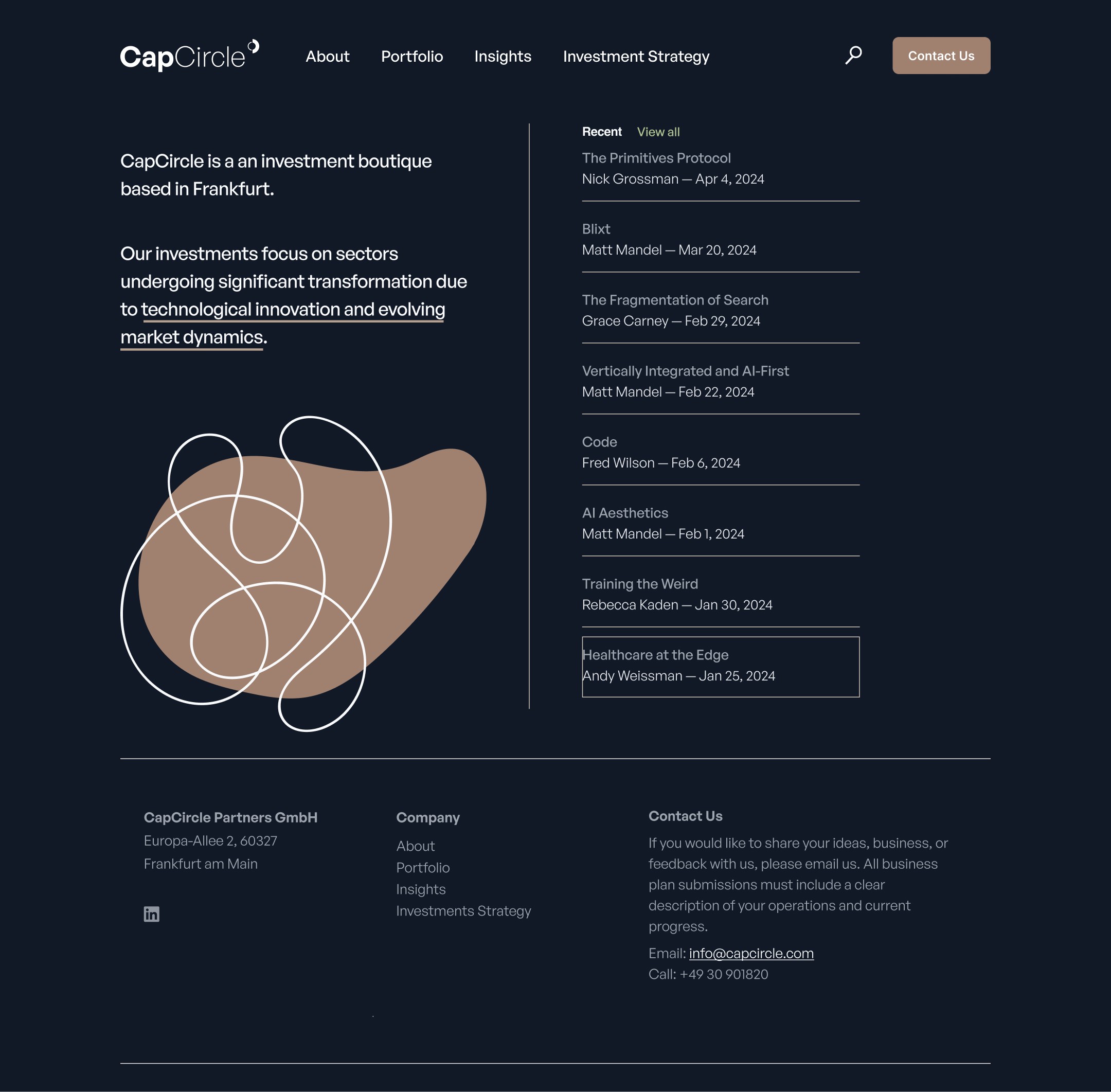
The visual examples below illustrate how CapCircle's color palette can be applied effectively in digital interfaces. The light and dark mode variations demonstrate the flexibility of the brand colors, ensuring clarity and visual appeal regardless of user settings or preferences.


Embera
Embera Partners, an Austrian boutique firm, specializes in investor and capital markets advisory. Their expertise spans financial advisory, investor relations, sustainability practices, and mergers and acquisitions. Embera takes a hands-on approach, working directly with executives to demystify capital markets challenges.
Brand Identity Development
Embera Partners sought a visual identity that would reflect their core values: trustworthy, experienced, and expert, while also conveying their passion for demystifying complex market challenges. The brand needed to project credibility and professionalism, yet remain approachable and entrepreneurial.
To achieve this balance, I created a distinctive logo combining a geometric symbol with elegant typography. The symbol, reminiscent of a stylized 'E', represents the intersection of Embera's diverse services and their interconnected approach to problem-solving. It also evokes the idea of a key, symbolizing Embera's role in unlocking solutions for their clients.

Embera Partners' standalone symbol: Interlocking squares forming an upward 'E', representing data interconnectivity, diversity, and progress in capital markets advisory.
The typography pairs Utopia, a sophisticated serif font, for "Embera" with Proxima Nova, a modern sans-serif, for "Partners." This combination strikes a balance between tradition and innovation, mirroring Embera's approach to financial advisory.
The color palette, centered around a deep Persian Indigo, reinforces trust and stability while conveying a sense of depth and expertise.
The main dashboard redesign tackles the challenge of presenting complex financial data in an accessible format. By implementing a tabbed interface and clear information hierarchy, users can now effortlessly navigate between different data views.
The layout incorporates various visualization methods, including bar charts, distribution graphs, scatter plots, and a comprehensive data table, enabling users to quickly grasp key insights or perform detailed analysis as needed.
#1B2854
#6A98C3
#0B141B
#D2D2D4
#E4E5E9
Brand Kit
The Embera Partners brand kit serves as a comprehensive guide for maintaining brand integrity across all platforms. It includes detailed specifications for logo usage, color implementation, and typography guidelines.
The kit outlines correct logo applications in various contexts, from digital to print and merchandise. It provides precise color codes for the Persian Indigo and complementary hues, ensuring visual cohesion across different media.
Typography guidelines detail the proper use of Utopia and Proxima Nova fonts, preserving the balance between tradition and modernity that characterizes Embera's visual identity.
BRAND KIT
EMBERA PARTNERS
Clear Space
BRAND KIT
EMBERA PARTNERS
Clear Space

BRAND KIT
EMBERA PARTNERS
Clear Space
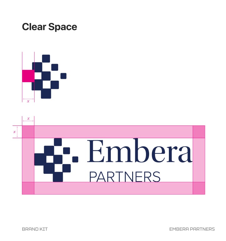
Reproduction of Embera Partners' brand kit page: Clear space guidelines illustrated with pink markers. This ensures the logo maintains its visual impact across various applications.
Logo Applications
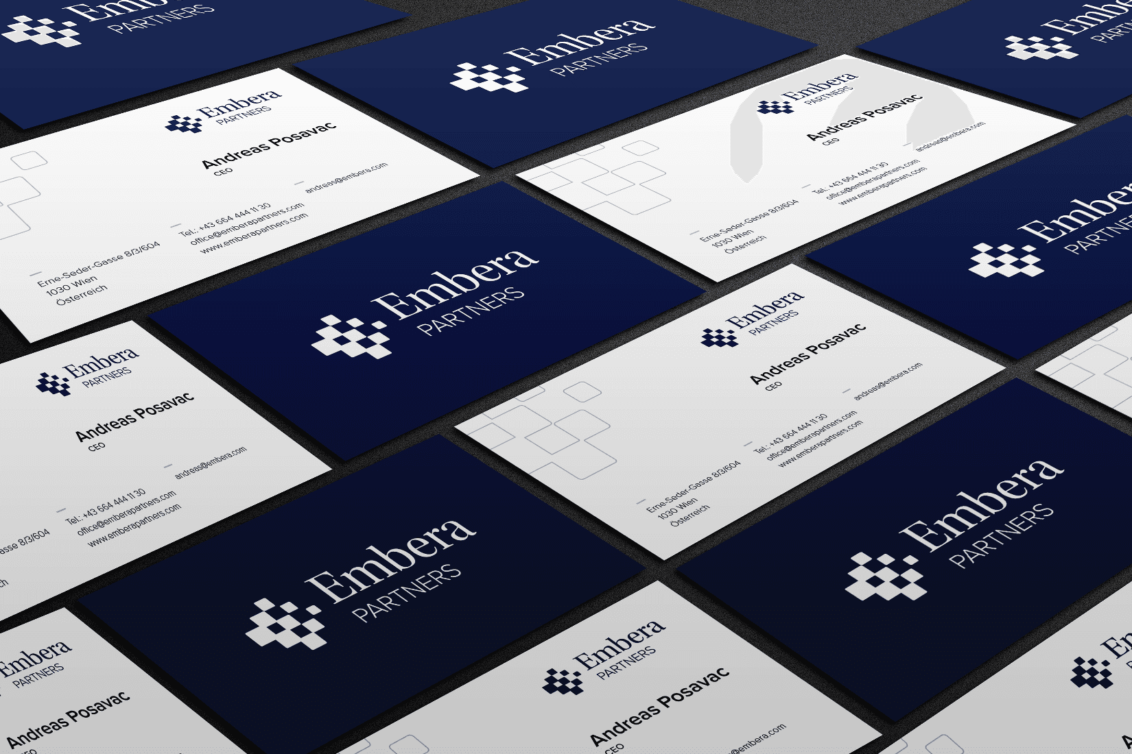
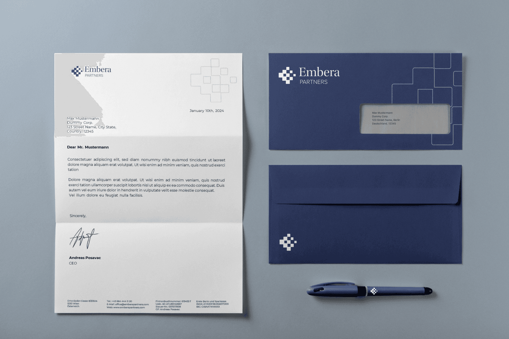
The true test of a brand's versatility is in its real-world applications. This section highlights how Embera Partners' new visual identity comes to life across multiple touchpoints. From business cards that make a lasting impression to stationery that reinforces brand consistency, each application demonstrates the logo's adaptability and impact.
These examples show how the design elements work together to create a cohesive and memorable brand experience in both professional and casual settings.
Conclusion
The branding projects for CapCircle and Embera Partners demonstrate how strategic design can elevate fintech companies. By developing unique visual identities that blend professionalism with innovation, these firms are now better positioned in their competitive markets. More than just visual appeal, the new brands capture each company's distinct approach and values, while providing a strong platform for growth.
Ultimately, this work highlights the importance of adaptable, refined branding in fostering trust and visibility within the dynamic financial technology sector.
Tags
Branding
Logo Design
Brand Kit
Tags
Branding
Logo Design
Brand Kit
Tags
Branding
Logo Design
Brand Kit
In 2023, I took on the challenge of creating brand identities for two forward-thinking fintech companies: CapCircle in Germany and Embera Partners in Austria. This project, along with my work for DebtRay (see DebtRay case study), deepened my interest in fintech. The fast-evolving financial technology sector combines traditional finance with modern innovation, offering a unique space for brand creation.
Fintech brands must inspire trust, convey accuracy, and balance stability with a modern edge. A successful brand communicates reliability—key in financial services—while also highlighting innovation. It's about balancing tradition with forward-thinking design.
For these identities, I focused on each company's values, audience, and market position. The goal was to simplify complex financial concepts into clear, memorable visuals that resonate with both tech-savvy investors and traditional institutions.
CapCircle
Based in Frankfurt, CapCircle is an investment boutique focusing on early-stage financial technology startups. Their approach involves leveraging partner knowledge and extensive networks in the financial sector.
Logo Design Process
The logo design for CapCircle aimed to create a simple, tech-savvy, and modern visual identity that would resonate with founders of fintech startups and tech industry investors.
I developed the logo using General Sans, a contemporary and versatile typeface. The design features a distinctive symbol of two arcs forming an open circle, representing the two "C"s in the company name and conveying ideas of connectivity and growth.
Two C's forming one circle: this symbol can be used as a standalone element, offering flexibility in various branding applications.
Color Palette
While the logo itself uses a stark black and white palette for a bold, contemporary look, CapCircle's broader color scheme combines grays, browns, and olive tones, creating a sophisticated and conservative aesthetic. This palette:
Conveys a sober, institutional quality fitting for financial investment
Enhances clarity and usability in digital and print materials
Uses grays as primary colors, brown tones for accents, and olive as a supplementary hue
This thoughtful color selection reinforces CapCircle's image as a trustworthy, professional player in the fintech investment space, while allowing for subtle visual distinctions in their branding.

Reproduction of CapCircle's color palette guidelines: This combination of gray, brown and olive tones creates a conservative yet sophisticated aesthetic, reinforcing the brand's position in fintech investment.
Colors in Practice
The visual examples below illustrate how CapCircle's color palette can be applied effectively in digital interfaces. The light and dark mode variations demonstrate the flexibility of the brand colors, ensuring clarity and visual appeal regardless of user settings or preferences.

Embera
Embera Partners, an Austrian boutique firm, specializes in investor and capital markets advisory. Their expertise spans financial advisory, investor relations, sustainability practices, and mergers and acquisitions. Embera takes a hands-on approach, working directly with executives to demystify capital markets challenges.
Brand Identity Development
Embera Partners sought a visual identity that would reflect their core values: trustworthy, experienced, and expert, while also conveying their passion for demystifying complex market challenges. The brand needed to project credibility and professionalism, yet remain approachable and entrepreneurial.
To achieve this balance, I created a distinctive logo combining a geometric symbol with elegant typography. The symbol, reminiscent of a stylized 'E', represents the intersection of Embera's diverse services and their interconnected approach to problem-solving. It also evokes the idea of a key, symbolizing Embera's role in unlocking solutions for their clients.

The tug-of-war of rebranding: Honoring heritage vs. embracing the new. Left: A nod to DebtRay's roots, reimagined with crisp geometry. Right: A leap into abstraction, where financial stability meets forward momentum. Both paved the way for the final design by revealing the fine line between familiarity and fresh appeal in fintech branding.
The typography pairs Utopia, a sophisticated serif font, for "Embera" with Proxima Nova, a modern sans-serif, for "Partners." This combination strikes a balance between tradition and innovation, mirroring Embera's approach to financial advisory.
The color palette, centered around a deep Persian Indigo, reinforces trust and stability while conveying a sense of depth and expertise.
The main dashboard redesign tackles the challenge of presenting complex financial data in an accessible format. By implementing a tabbed interface and clear information hierarchy, users can now effortlessly navigate between different data views.
The layout incorporates various visualization methods, including bar charts, distribution graphs, scatter plots, and a comprehensive data table, enabling users to quickly grasp key insights or perform detailed analysis as needed.
#1B2854
#6A98C3
#0B141B
#D2D2D4
#E4E5E9
Brand Kit
The Embera Partners brand kit serves as a comprehensive guide for maintaining brand integrity across all platforms. It includes detailed specifications for logo usage, color implementation, and typography guidelines.
The kit outlines correct logo applications in various contexts, from digital to print and merchandise. It provides precise color codes for the Persian Indigo and complementary hues, ensuring visual cohesion across different media.
Typography guidelines detail the proper use of Utopia and Proxima Nova fonts, preserving the balance between tradition and modernity that characterizes Embera's visual identity.
BRAND KIT
EMBERA PARTNERS
Clear Space
Reproduction of Embera Partners' brand kit page: Clear space guidelines illustrated with pink markers. This ensures the logo maintains its visual impact across various applications.
Logo Applications
The true test of a brand's versatility is in its real-world applications. This section highlights how Embera Partners' new visual identity comes to life across multiple touchpoints. From business cards that make a lasting impression to stationery that reinforces brand consistency, each application demonstrates the logo's adaptability and impact.
These examples show how the design elements work together to create a cohesive and memorable brand experience in both professional and casual settings.
Conclusion
The branding projects for CapCircle and Embera Partners demonstrate how strategic design can elevate fintech companies. By developing unique visual identities that blend professionalism with innovation, these firms are now better positioned in their competitive markets. More than just visual appeal, the new brands capture each company's distinct approach and values, while providing a strong platform for growth.
Ultimately, this work highlights the importance of adaptable, refined branding in fostering trust and visibility within the dynamic financial technology sector.
Tags
Branding
Logo Design
Brand Kit
© 2025 Fabricio Waltrick. Impressum | Datenschutz
© 2025 Fabricio Waltrick. Impressum | Datenschutz
© 2025 Fabricio Waltrick. Impressum | Datenschutz
© 2025 Fabricio Waltrick. Impressum | Datenschutz
